A great catalog does more than showcase products — it guides the eye, builds desire, and makes the next step (clicking, buying, inquiring) feel obvious. If you’re refreshing an existing catalog or building your first one, here are design ideas worth borrowing, organized by what they’re best at solving.
For a cleaner, more scannable layout
- Lead with a hero spread. Open with one strong visual and minimal text rather than a grid of small products. It sets the tone and gives readers a reason to keep scrolling.
- Use a consistent grid system. Whether it’s 2 products per row or 4, pick a grid and stick to it across sections. Consistency reads as professional; constant variation reads as cluttered.
- Group by use case, not just category. Instead of “all chairs” and “all tables,” try “Small Space Living Room” or “Outdoor Entertaining Set.” It mirrors how people actually shop.
- Leave intentional white space. Dense pages feel harder to shop, even when the products themselves are appealing. Give each product room to breathe.
For stronger visual impact
- Let photography do the heavy lifting. Lifestyle shots (products in context) tend to outperform flat product-on-white images for engagement, especially on browsing-first pages.
- Build a color story per section. A seasonal catalog benefits from a cohesive palette — it makes each section feel curated rather than like a random product dump.
- Use typography to create hierarchy. One display font for section headers, one clean sans-serif for body copy and pricing. Too many fonts undercuts the polish of even great photography.
- Add texture through layout, not just imagery. Full-bleed images, asymmetric grids, and varied page rhythm keep a long catalog from feeling monotonous page after page.
For a more interactive, digital-first experience
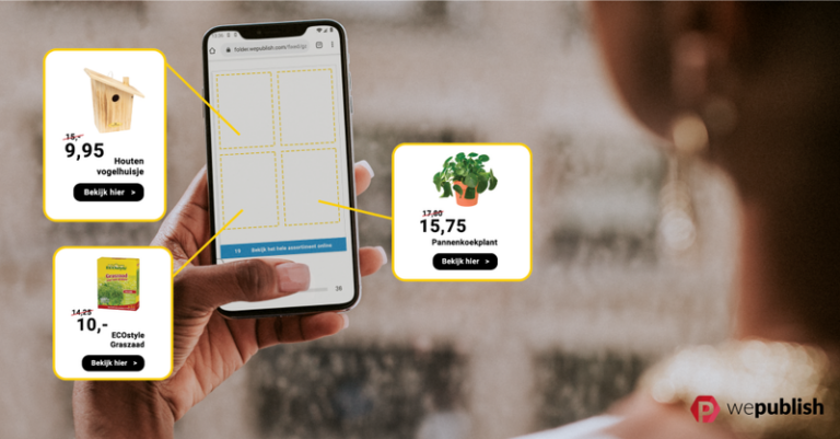
- Add shoppable hotspots directly on images. Instead of a static lifestyle photo, let readers click on individual items within the scene to see pricing and details.
- Include a search bar for longer catalogs. If you’re publishing 40+ pages, browsing alone isn’t enough — a search function respects your reader’s time.
- Use video or motion sparingly, but intentionally. A short product demo clip on a key spread can do more than three static images, without needing to be used throughout.
- Build in a “quick jump” navigation. Category tabs or a clickable table of contents at the front let readers skip straight to what they care about.
For driving action
- Place a clear CTA on every spread that needs one. “Shop Now,” “Find a Store,” or “Get a Quote” — don’t rely on readers to infer the next step.
- Use social proof where it’s earned. A short review snippet or “bestseller” tag next to a product builds confidence at the point of decision.
- Design your closing page as intentionally as your cover. End with a clear next action — a link to your full catalog online, a discount code, or contact details — rather than letting the catalog just stop.
Turning design ideas into a real catalog
Good design ideas only go so far if your catalog is still a static PDF. Platforms like WePublish let you take a layout you’ve already designed — in InDesign, Canva, or elsewhere — and turn it into an interactive, shoppable catalog with clickable products, search, and analytics, without starting from scratch.
If you want a full walkthrough of the build process, see our guide on how to create a catalog. Or if you’re ready to bring one of these ideas to life, you can start building your catalog free for 14 days.